Signal Messenger
Interface Design, Product Strategy, Design System
Role: Product Design Lead
Team: Working with the CEO and 5-8 developers (as the team grew)
Status: Shipped incrementally Mar 2018 — Feb 2020
Signal Messenger (signal.org) is a secure communication platform designed to be as simple and easy to use as possible, without compromising privacy. I joined Signal in 2018 as the first full-time designer, right as Signal received substantial funding for the first time and started to grow.
The challenges Signal faced were significant — it was primarily seen as a niche messenger, used for specific tasks that required privacy. The goal was to shift that perception: like privacy, Signal is for everybody.
To do that, we focused on two things for the first year or so: shipping crucial features, and unifying the design with a focus on simplicity and accessibility. This case study will detail the efforts of the latter.
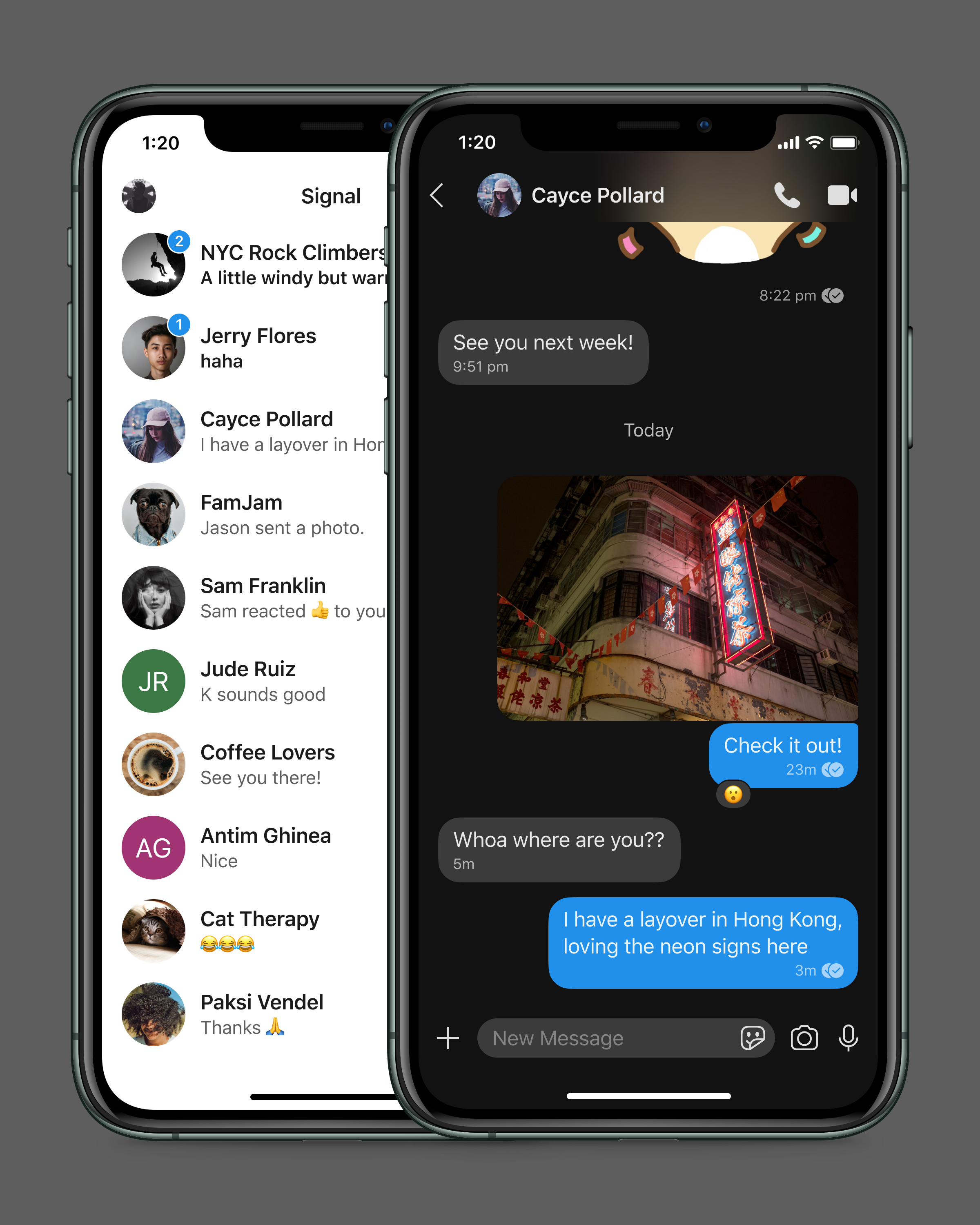
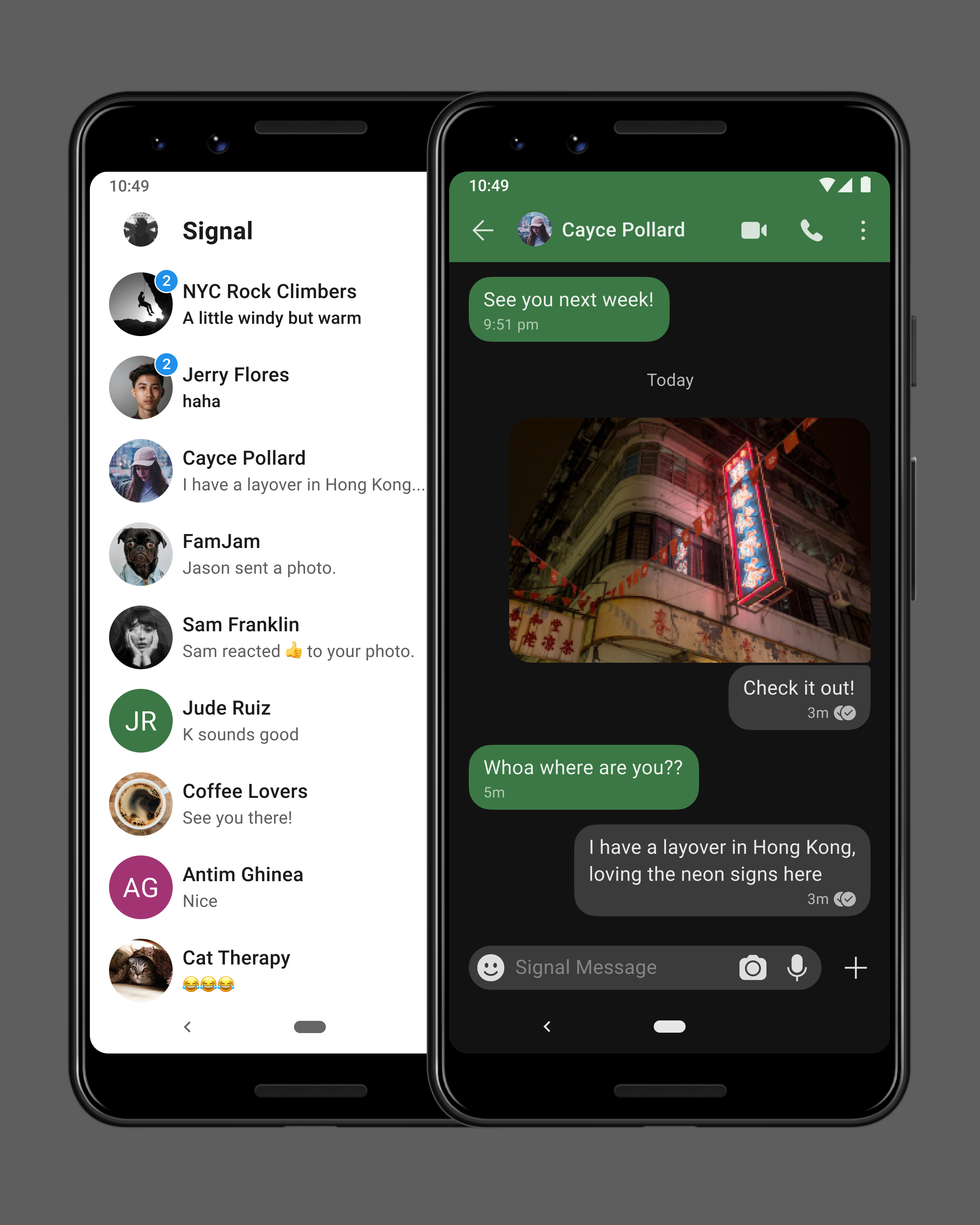
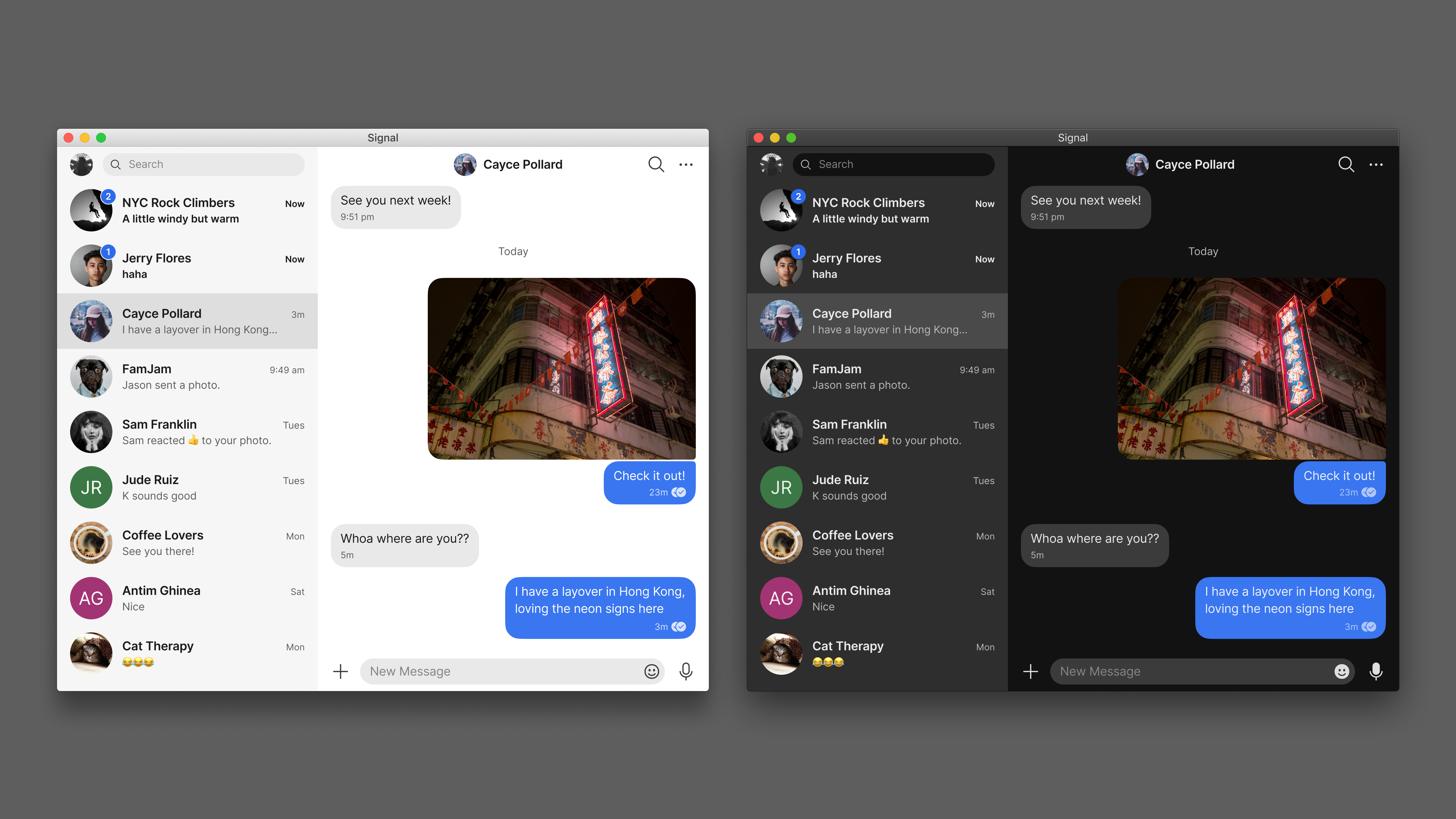
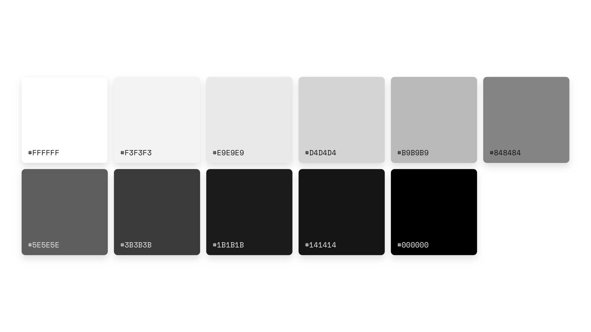
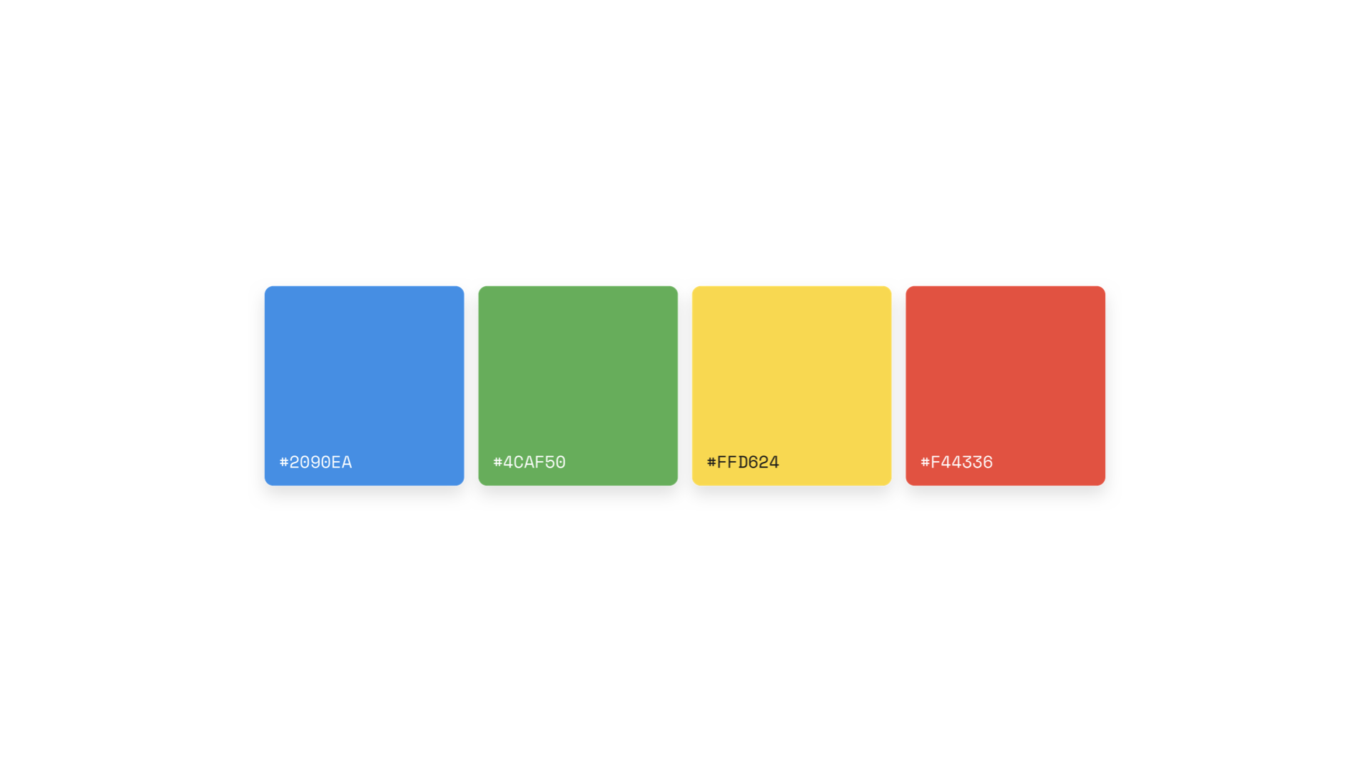
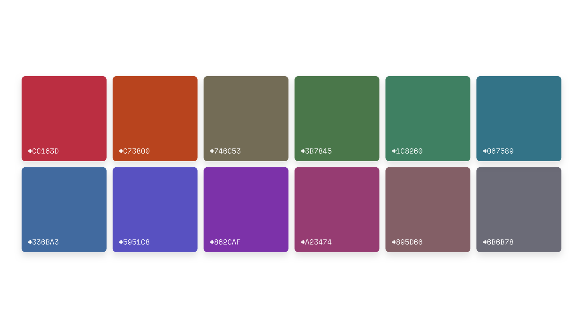
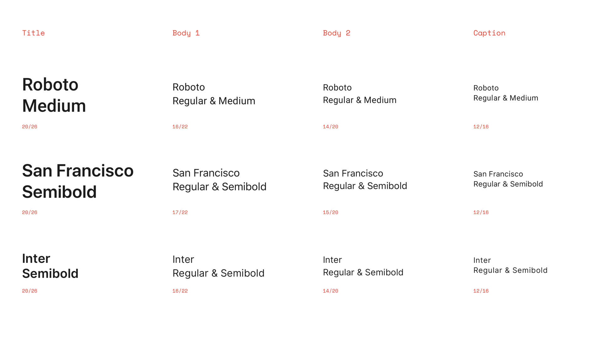
The first thing we needed to do was build a strong foundation for the design. A unified color and type palette for all platforms was the first step, with a focus on improving accessibility (especially color contrast, which was a problem in the old design). Dark mode was also built into the new color scheme, which was already built into Android and desktop, and came to iOS soon after.
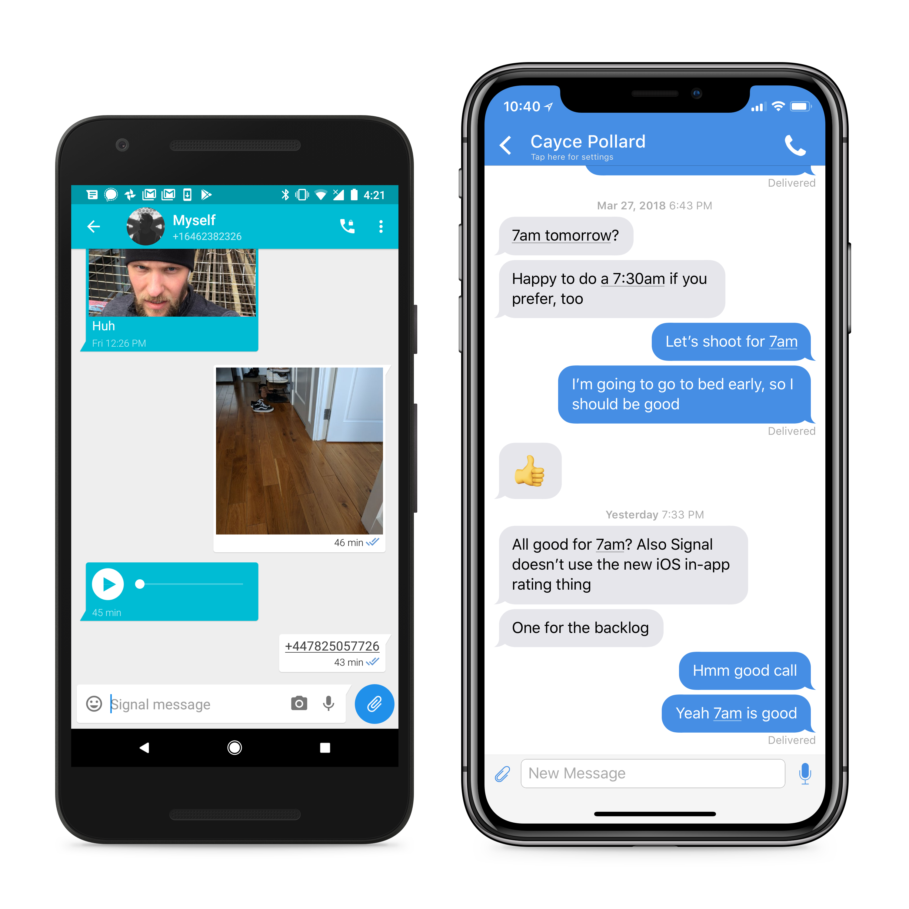
Once the foundation was built, our focus shifted to the message design. At the time each platform had its own unique design for the message bubble and supporting information (read receipt, timestamp, etc). The goal was to unify with one design for all platforms, simplifying both the design and development process, and improving the user experience.
Additionally, during this time we were quickly adding new message types (quoted replies, image albums, link previews, and contact shares all launched during this time) and needed a more robust system to support all the new formats.
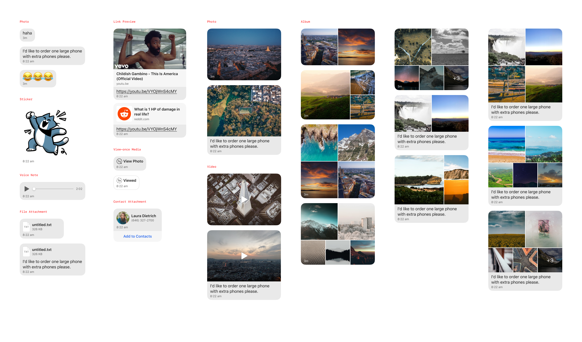
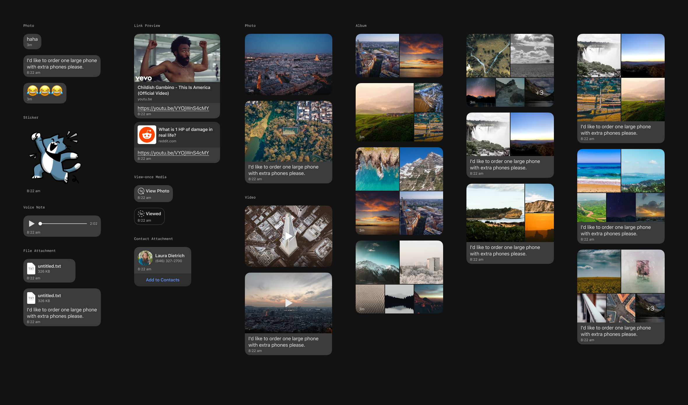
The new design system (color, type, grid and message designs) shipped in late 2018, and has evolved since as we shipped new features and continued to improve the user experience.
The user base of Signal has not been disclosed publicly, but growth has been significant. Many publications and influential figures have weighed in:
For years a bare-bones texting and calling app, Signal has increasingly become a fully featured, mainstream communications platform. With its new coding muscle, it has rolled out features at a breakneck speed: In just the last three months, Signal has added support for iPad, ephemeral images and video designed to disappear after a single viewing, downloadable customizable "stickers," and emoji reactions.
I love @signalapp. It’s come such a long way!