Facebook Interface Guidelines
Design System
Role: Product Designer
Team: Interfaces design (~10 designers), collaborating with all of Facebook design
Status: Initial version shipped in Feb 2016
As part of the Intefaces design team, I helped build and launch Facebook’s first comprehensive design system. Until this point, Facebook's UI library was a hodgepodge of components maintained by volunteers.
In late 2015 the Interfaces design team was formed to formalize the design system and create a process for maintaining it. I joined the team early on and was part of this early push to ship a full library (note: this case study is focused on the work that I specifically contributed, not a comprehensive overview of the design system).
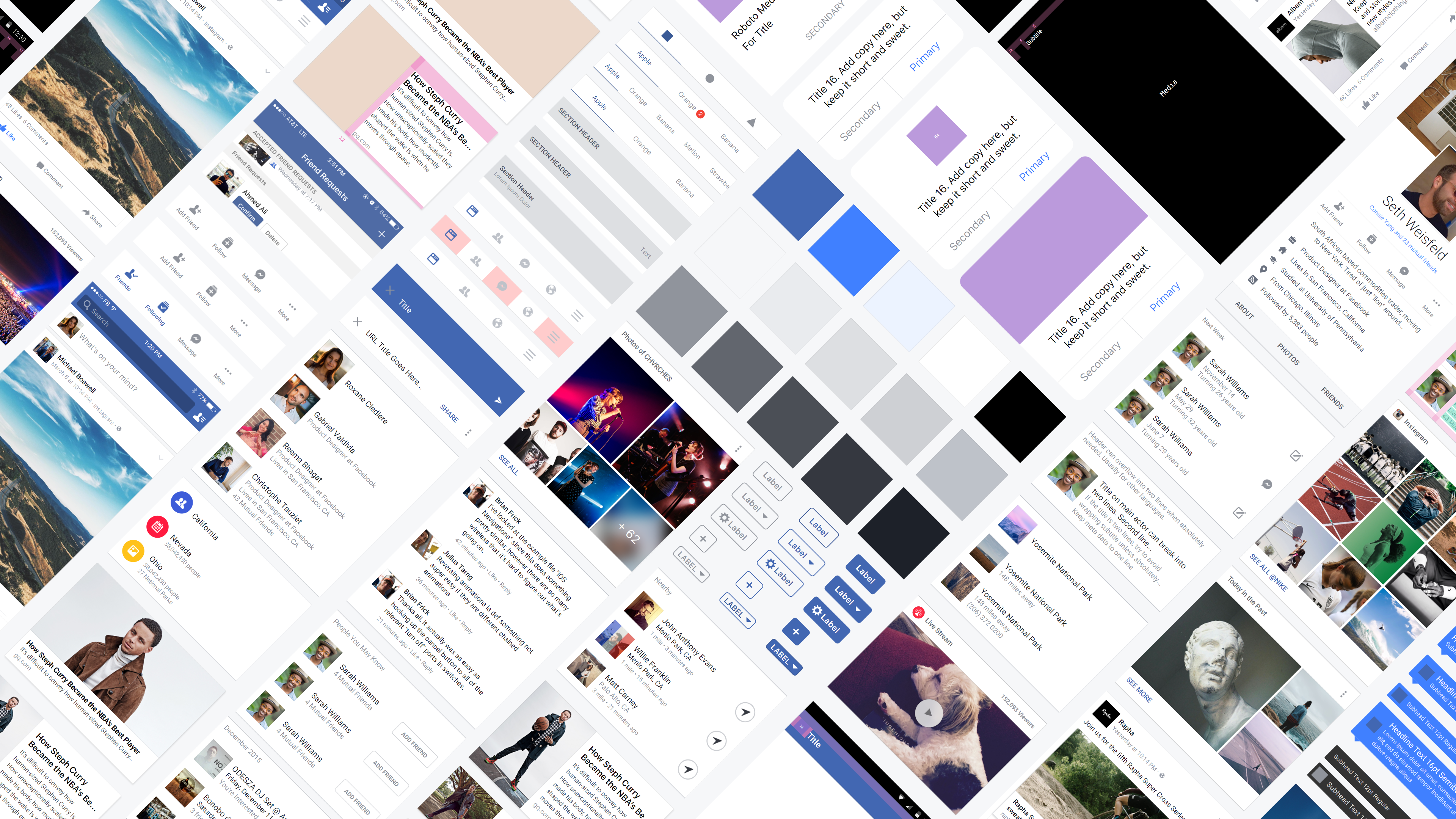
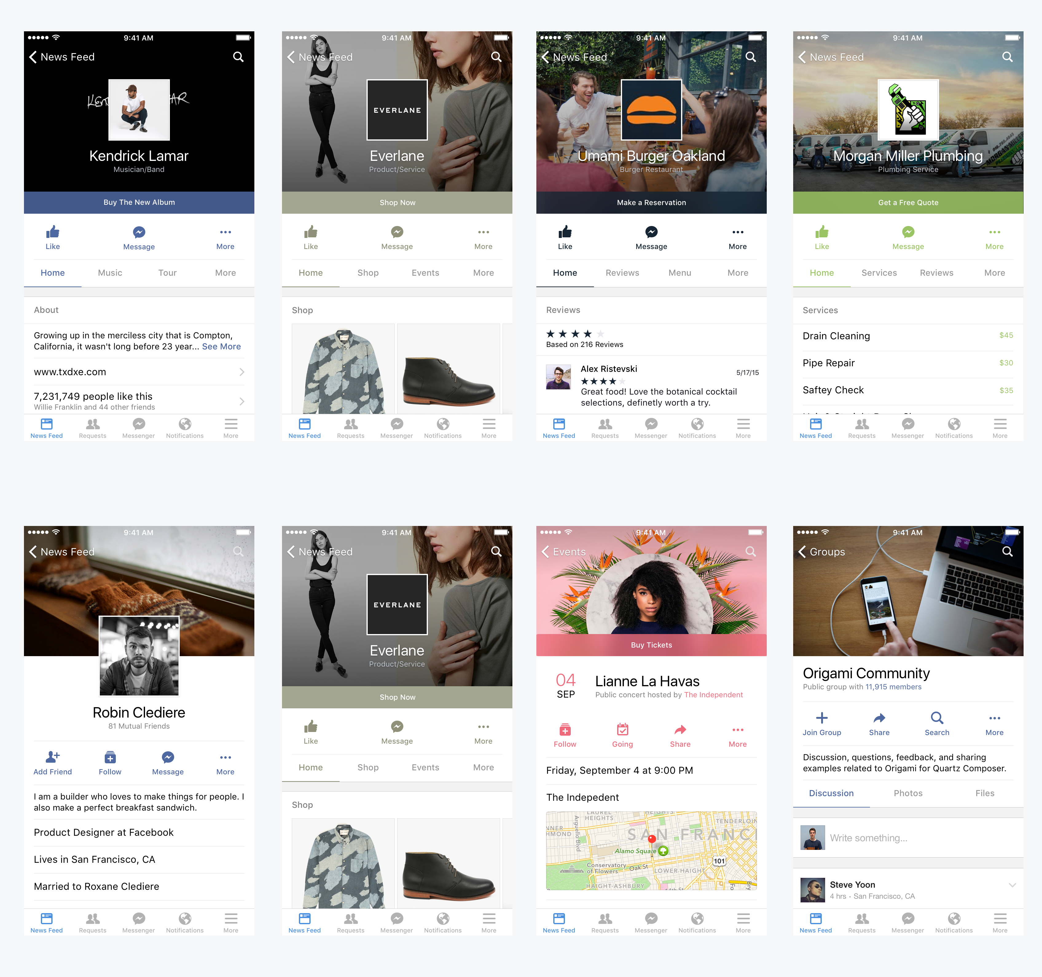
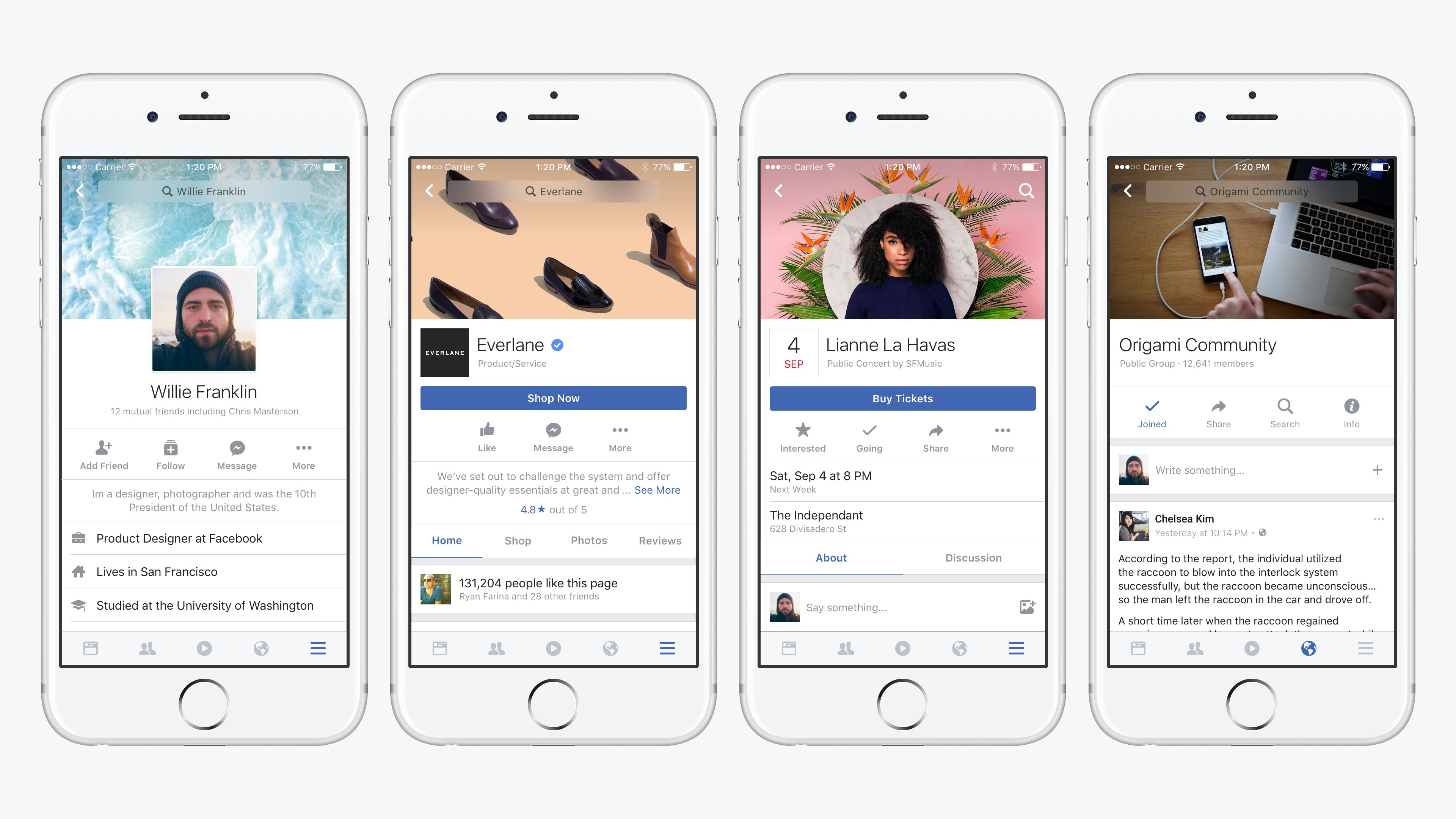
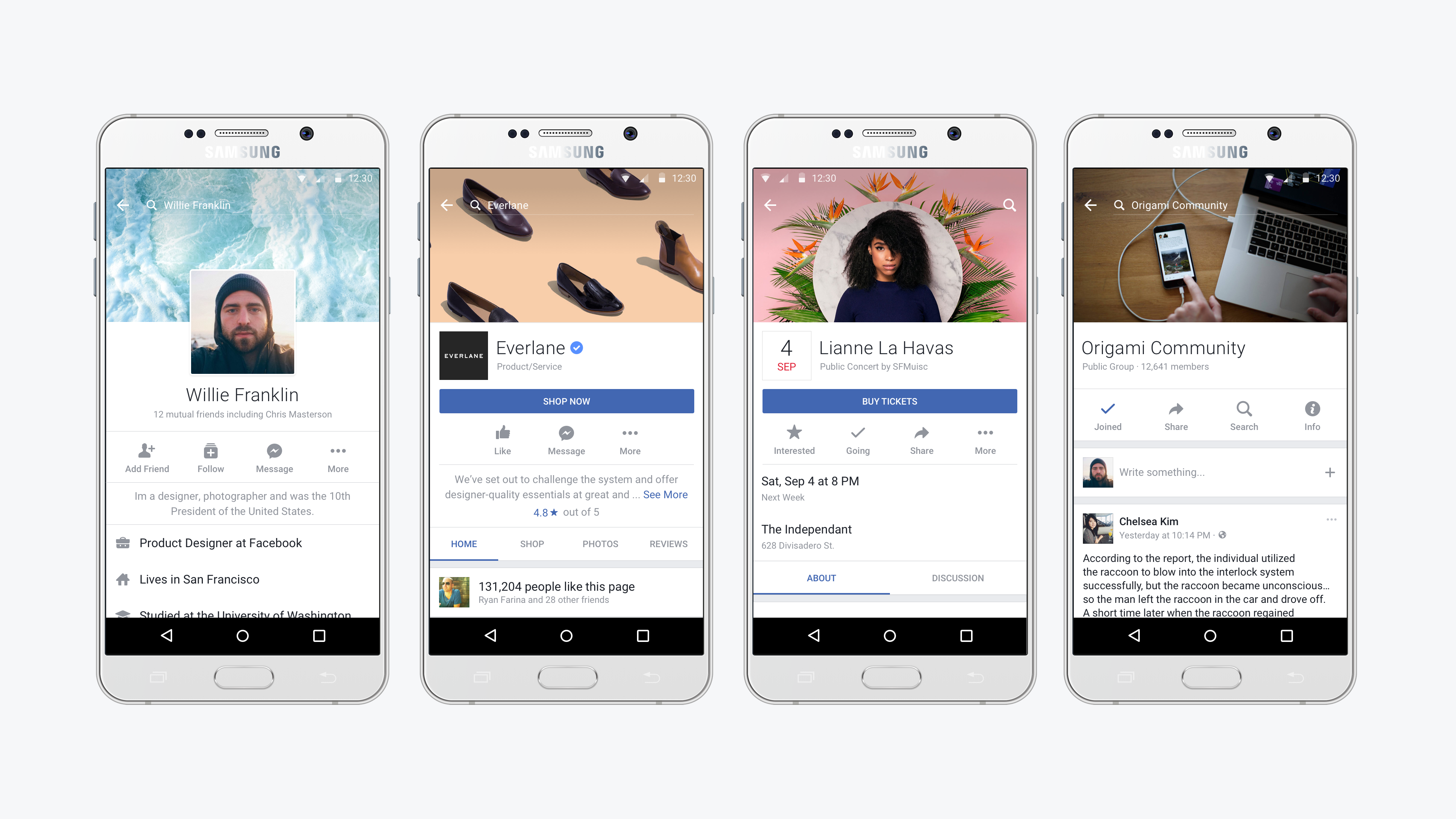
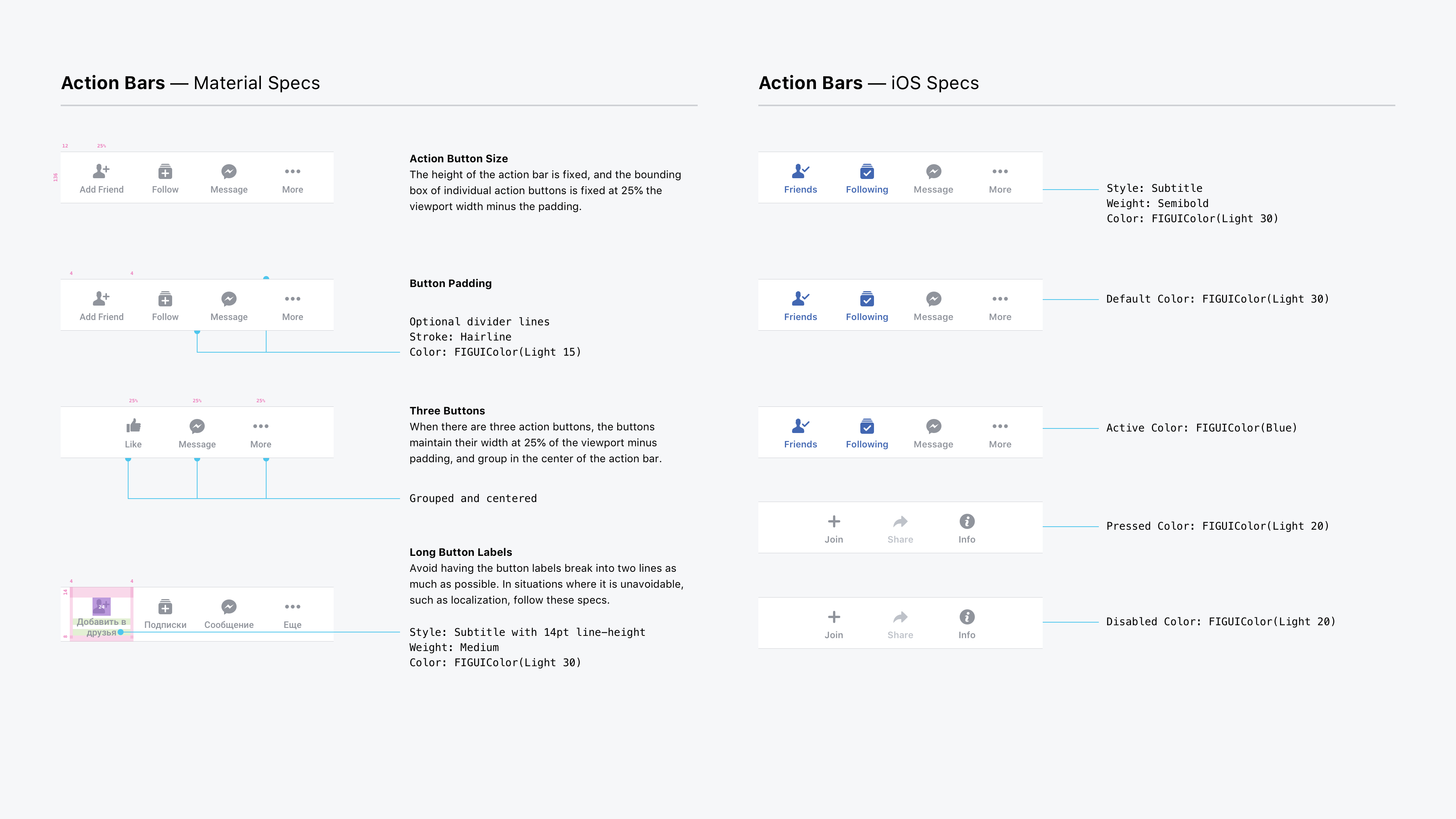
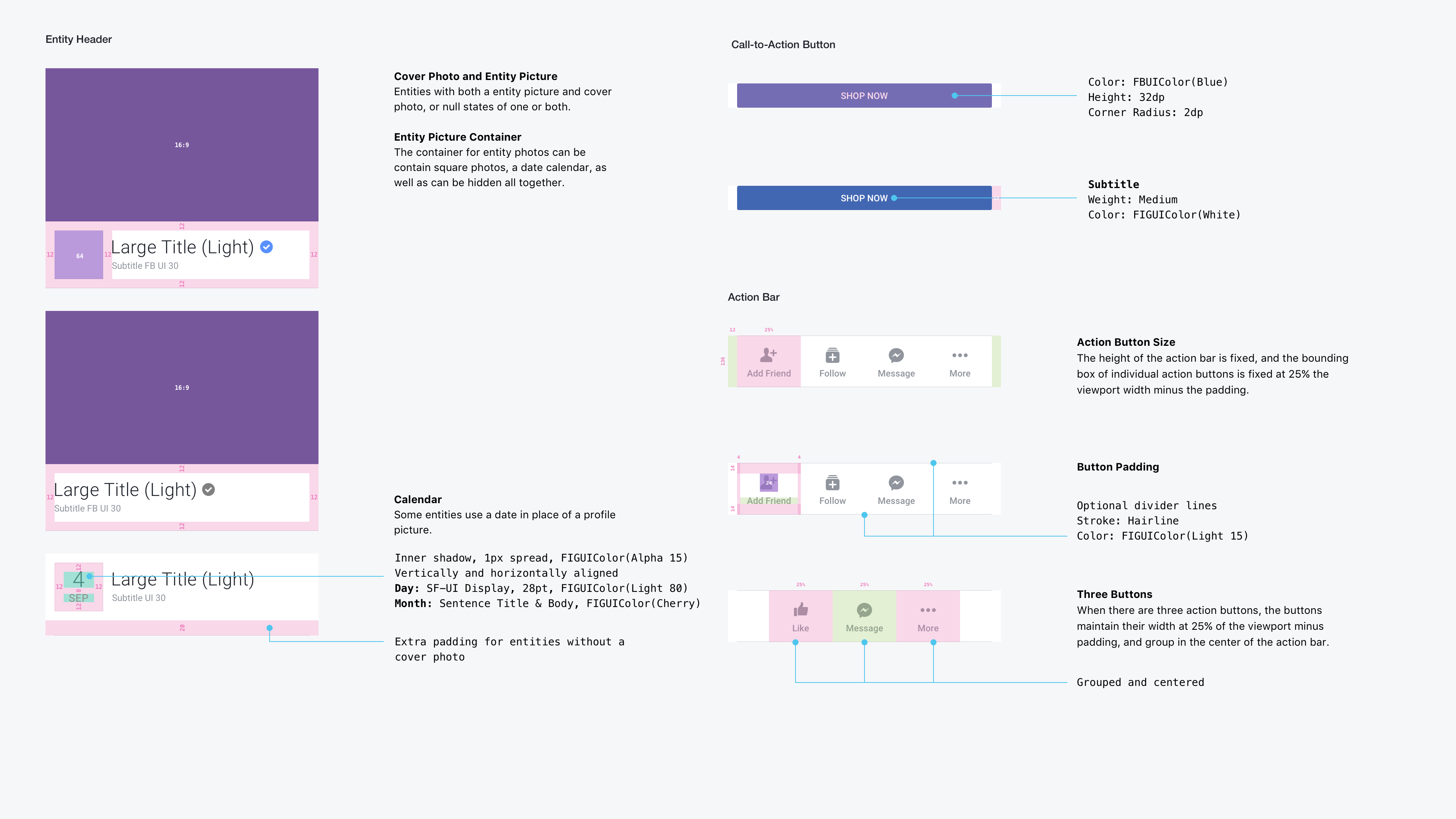
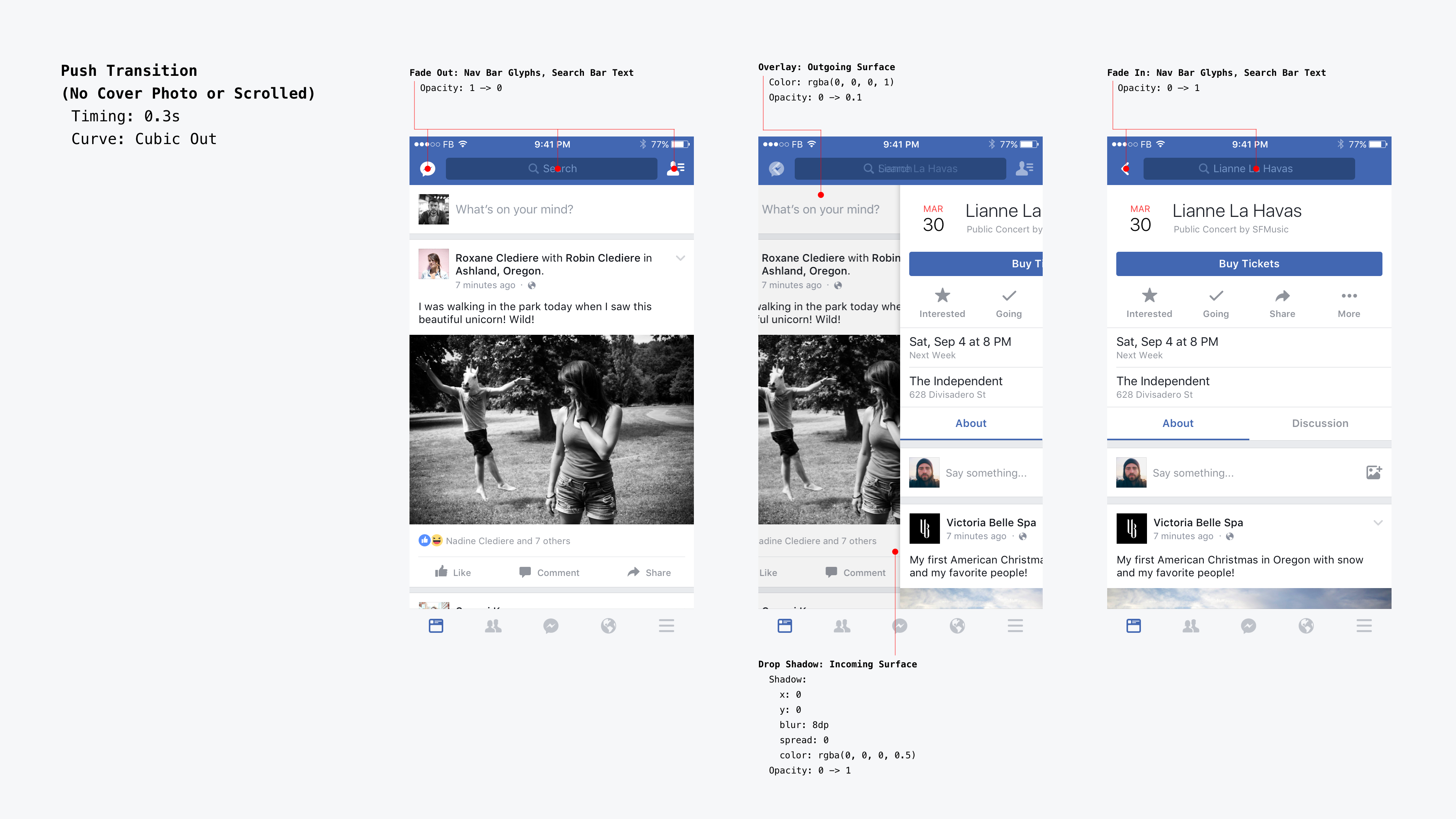
The inital library included the type system, color palette, iconography, and UI components. It was developed by working with individual design teams to adapt their key UI into a broader system. For example, I worked closely with the Profile, Pages, Events and Groups teams to create an "Entity Header" component that is used by each of these teams.
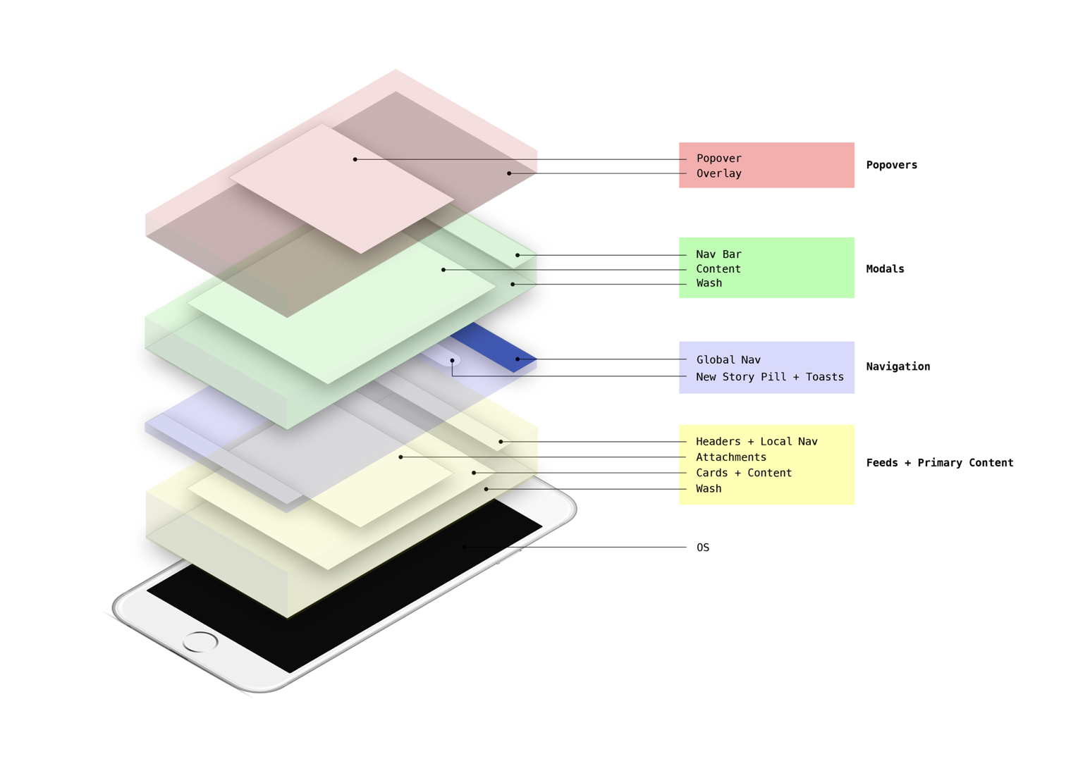
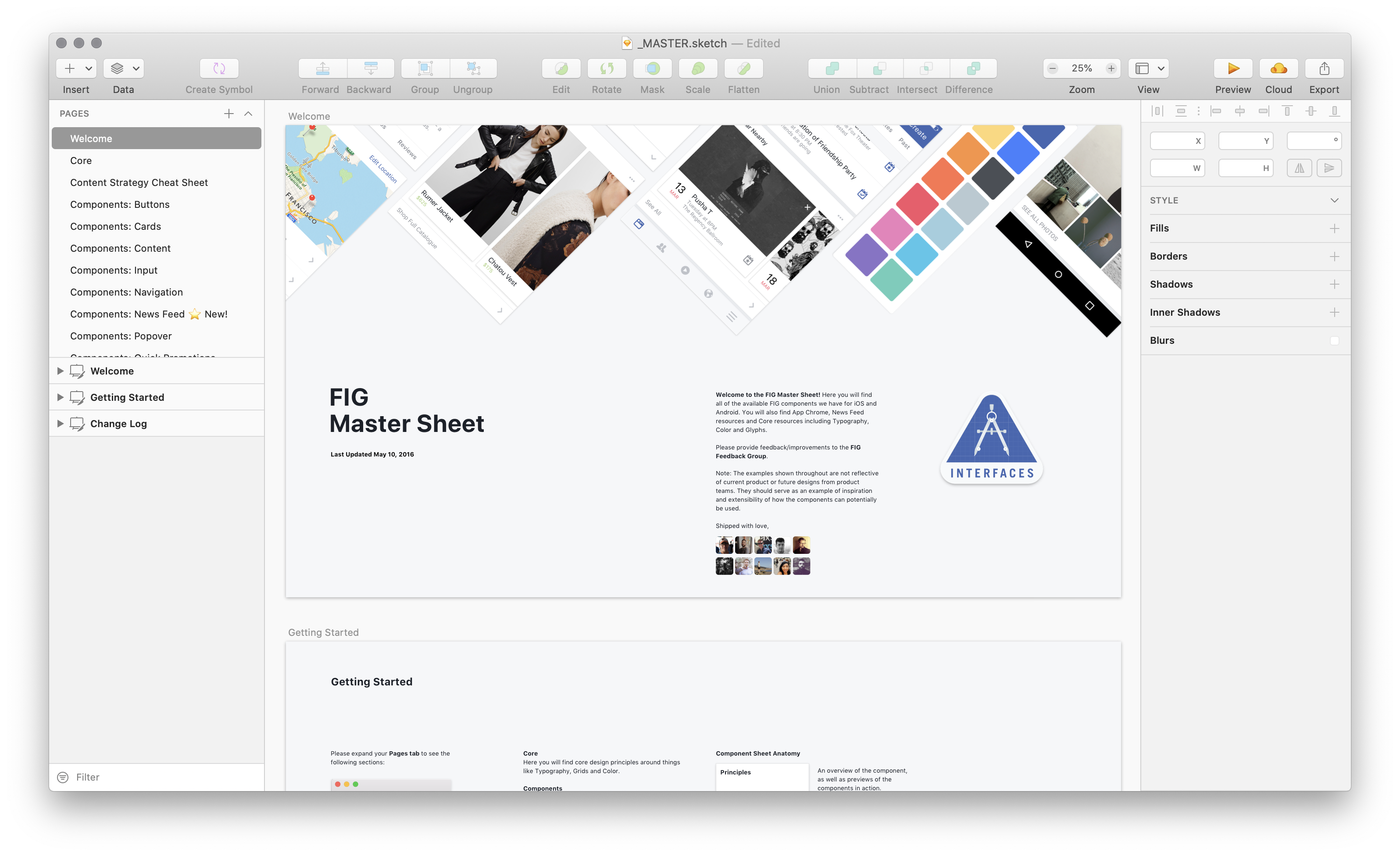
We shipped the first version of the Facebook Interface Guidelines (FIG) in February 2016. It was initially distributed as one large "Master Sheet" with every component, including specs and implementation details. This was later replaced by a plugin for Sketch.
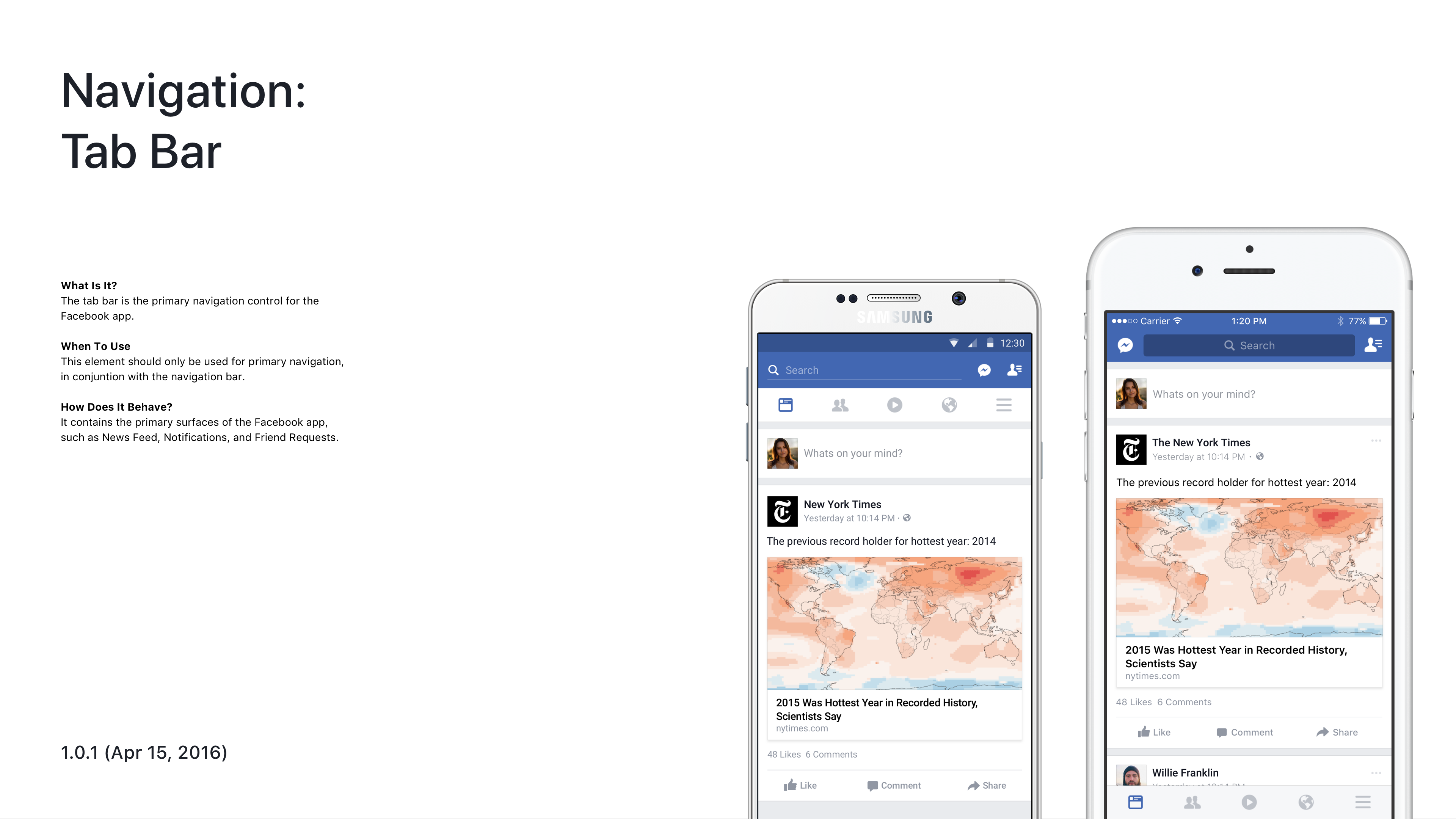
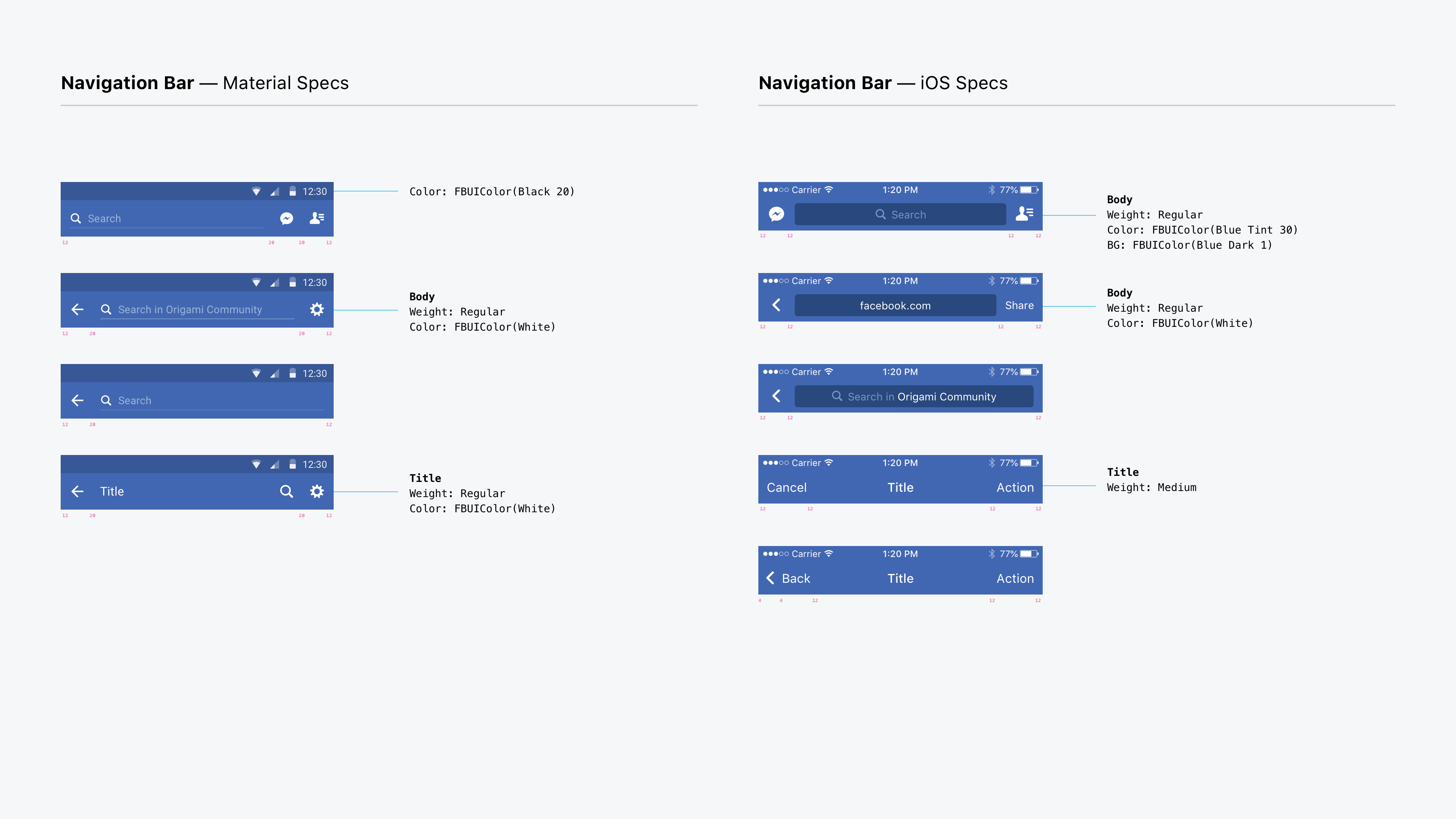
The FIG library was adopted quickly by Facebook's 300+ designers, and has since continued to grow and adapt as the foundation of Facebook's UI on every platform.